
Total 212 Questions
Last Updated On : 18-Oct-2026

You have the following tiled dashboard that has one sheet.
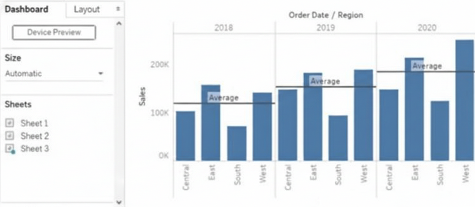
You want to replace the sheet with Sheet2.
What should you do?
A. Right-click Sheet2 and select Add to Dashboard.
B. Select Sheet3 and click the Swap Sheet button next to Sheet2.
C. From the context menu of Sheet3. select Remove Dashboard item
D. Drag Sheet2 to the dashboard.
E. From the context menu of Sheet3. select Deselect
Explanation
In a tiled Tableau dashboard, a sheet can be replaced by dragging another sheet into its tile area. Tableau highlights the target location and automatically swaps the sheet while keeping the existing layout, size, spacing, and formatting intact. This drag-and-drop method avoids deleting objects or adding extra tiles and is the only direct way to replace a sheet without altering the dashboard’s structure.
🟦 Correct Answer: D. 🟦 Drag Sheet2 to the dashboard
Dragging Sheet2 onto the tile where the existing sheet is displayed allows Tableau to immediately replace it while preserving the layout. This method maintains formatting, spacing, borders, and sizing with no extra cleanup or adjustments, making it the most efficient and accurate way to replace a sheet on a tiled dashboard.
🟥 Why the other options are incorrect
A. 🟥 Right-click Sheet2 and select “Add to Dashboard”
This action adds Sheet2 as a new extra tile instead of replacing the existing one. It requires manual removal or rearrangement afterward, causing additional effort and layout disruption.
B. 🟥 Select Sheet3 and click the Swap Sheet button
Tableau dashboards do not contain a swap sheet button. Swapping can only be performed using drag-and-drop. This option refers to a non-existent feature.
C. 🟥 From the context menu of Sheet3, select “Remove Dashboard item”
Removing the item deletes the tile and breaks the layout, forcing you to rebuild spacing and repositioning. It does not replace the existing sheet and adds unnecessary steps.
E. 🟥 From the context menu of Sheet3, select “Deselect”
Deselect does not change dashboard content or layout. It cannot replace, swap, or remove sheets, making it irrelevant to modifying dashboard objects.
🔗 Official Reference
📄 Tableau Help — Create a Dashboard
What should a Data Analyst use to visualize the distribution and variability of measure values along an axis?
A. Bullet Graph
B. Box Plot
C. Scatter Plot
D. Histogram
Explanation
When you need to show how a measure is distributed (spread, central tendency, outliers, skewness) across categories or time, the chart that explicitly displays variability along an axis with clear statistical markers is a box-and-whisker plot.
🟢 Correct Option: B. Box Plot
A Box Plot visually summarizes distribution and variability in one glance:
The box shows the interquartile range (25th to 75th percentile)
The line inside is the median
Whiskers extend to min/max (or 1.5× IQR)
Dots beyond whiskers are outliers
Perfect for comparing variability of a continuous measure (e.g., Sales, Profit, Duration) across categories.
🔴 Incorrect Option: A. Bullet Graph
Bullet graphs are designed for comparing a primary measure against a target and benchmarks (like a gauge alternative). They show performance, not statistical distribution or variability of the underlying data points.
🔴 Incorrect Option: C. Scatter Plot
Scatter plots are excellent for showing relationships or correlation between two continuous measures, or spotting clusters/outliers individually. They do not summarize distribution (median, quartiles, whiskers) in a compact statistical way like a box plot does.
🔴 Incorrect Option: D. Histogram
Histograms show the frequency distribution of a single measure using bins, but they are not placed “along an axis” of categories. They visualize one overall distribution, not side-by-side variability across multiple groups.
Reference:
Tableau Official – Build a Box Plot
You want to connect a Tableau workbook to a dataset in a Microsoft Excel spreadsheet.
What should you do from Tableau Desktop?
A. From the Data menu select New Data Source
B. From the Data menu select Replace Data Source
C. From the File menu select Import Workbook
D. From the File menu select New
Explanation
Connecting a Tableau workbook to an Excel spreadsheet requires establishing a live or extract connection to the file so Tableau can read its sheets, named ranges, or tables. This is always initiated through the dedicated connection workflow in Tableau Desktop, not by opening or importing the workbook itself. Only one menu option starts this process correctly.
Correct Option:
✅ A. From the Data menu select New Data Source
This is the official and only way to add a brand-new Excel file (or any other data source) to your workbook. Choosing Data → New Data Source opens the Connect pane, where you select “Microsoft Excel,” browse to your .xlsx or .xls file, and Tableau instantly previews sheets and connections. You can then join multiple sheets, create relationships, or build extracts.
Incorrect Options:
❌ B. From the Data menu select Replace Data Source
→ Replace Data Source is strictly for swapping an existing connection with another data source that has identical structure (same field names and data types). It cannot be used to introduce a completely new Excel file and will be grayed out if no data source exists yet.
❌ C. From the File menu select Import Workbook
→ There is no “Import Workbook” command in Tableau Desktop. The File menu offers Open, Save, Export as .twbx, etc., but none of these options establish a data connection to an external Excel file.
❌ D. From the File menu select New
→ File → New creates an empty workbook with no data sources attached. While you can add data afterward, this step alone does not connect to Excel—it only clears the current workspace and starts a blank canvas.
Reference:
Tableau Official Help – Connect to Excel: Excel
New vs Replace Data Source (official distinction): Blend Your Data
You have the following chart that shows profits and discounts over time.
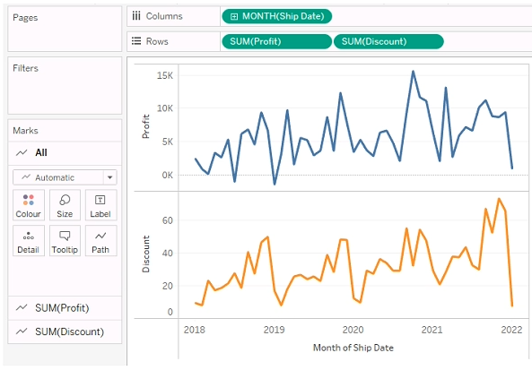
You need to combine the lines to appear as shown in the following chart.
.png)
What should you do?
A. Drag Discount to Color on the Marks card
B. Convert Discount to Discrete
C. Set Discount to Dual Axis
D. Drag Discount to the Columns shelf
Explanation
When you want to show two measures (e.g. Profit and Discount) together on a single chart over time, using a dual-axis is the standard way in Tableau to overlay two independent value lines — each with its own axis, but sharing the same time dimension on the x-axis. This lets each measure keep its own scale (if required) while combining them visually in one view. Other methods won’t properly overlay two continuous measure-lines with separate axes.
Why 🟢 C (Dual Axis) is correct
Setting Discount to Dual Axis ensures both measures (Profit and Discount) draw on the same time-based X-axis but with separate Y-axes. This allows Tableau to overlay the two lines in the same pane, while preserving independent scaling and visual clarity. Once dual axis is applied, you can use the Marks card to ensure each line has its own style/color.
❌ Why the other options are incorrect
🔴 A. Drag Discount to Color on the Marks card
Dragging Discount to color would only change the color encoding of existing marks — it doesn’t add a second measure. You would still have just one measure (e.g. Profit) plotted; Discount would be used merely as a color dimension, not drawn as a separate line. So you won’t get two lines.
🔴 B. Convert Discount to Discrete
Converting Discount to discrete changes how Tableau treats discount values — as categorical, not continuous measures. That won’t cause it to plot Discount as a second continuous measure over time. Instead, it would treat discount as categories, not a meaningful line trend over time. That fails your goal of “combining lines over time.”
🔴 D. Drag Discount to the Columns shelf
Dragging Discount to Columns would create a different chart dimension (e.g. separate columns per discount value) — not overlay Discount as a second measure over time. This restructures the chart, rather than combining measures along the time axis. It is not how you overlay two measures over the same time series.
Summary
To overlay two measures (Profit and Discount) over time in one chart in Tableau, you should use Dual Axis — this overlays the measures with independent axes but a common time dimension. Other approaches (color encoding, discrete conversion, moving to Columns) do not create a proper dual-measure overlay. Dual-axis is the correct, standard method in Tableau for this scenario.
You have a dataset that contains sates data. The following is a sample of the data.
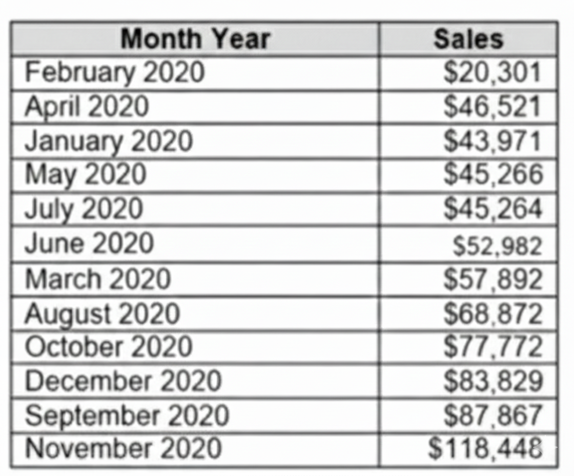
You need to return a value of true if a month has sales greater than $50 000. otherwise the formula must return a value of false.
Which two formulas achieve the goal. Choose two
A. SUM{[Sales]) IN (50000)
B. IIF(SUM< [Sales] )>50000, TRUE, FALSE)
C. MAX< [Sales], 50000)
D. [Sales] > 50000
Explanation:
In Tableau, evaluating whether monthly sales exceed a specific threshold requires a combination of aggregation and logical comparisons. The formula must correctly sum or reference the monthly sales and return a Boolean TRUE or FALSE. Incorrect syntax or using row-level calculations without proper aggregation can lead to errors or inaccurate results. Using the correct approach ensures accurate evaluation across the dataset and meets the exam requirement.
Correct Option – ✔️ B. IIF(SUM([Sales]) > 50000, TRUE, FALSE):
This formula works because it first aggregates all sales for the month using SUM([Sales]) and then evaluates whether the total exceeds 50,000. The IIF function explicitly returns TRUE if the condition is met and FALSE if it is not. This ensures that the formula evaluates the monthly total, not individual rows, making it the most reliable solution for the requirement.
Correct Option – ✔️ D. [Sales] > 50000:
This formula works when [Sales] is already summarized at the monthly level. The expression evaluates to TRUE if the monthly total exceeds 50,000 and FALSE otherwise. While it is simpler than Option B, it depends on the aggregation context. If [Sales] is already aggregated per month, this formula provides a clear and readable way to implement the Boolean logic.
Incorrect Option – ❌ A. SUM{[Sales]) IN (50000):
This formula is invalid in Tableau. The syntax SUM{[Sales]) is incorrect, and the IN operator is used for set membership, not threshold comparisons. Using this formula would produce an error and cannot correctly determine whether monthly sales exceed 50,000.
Incorrect Option – ❌ C. MAX< [Sales], 50000):
This formula is also invalid. Even if rewritten correctly as MAX([Sales]) > 50000, it would check only the largest individual sale in the month rather than the total sales. Because the requirement is to evaluate total monthly sales, this formula would not produce accurate results.
Summary:
The most reliable approach is ✔️ Option B, IIF(SUM([Sales]) > 50000, TRUE, FALSE), because it correctly aggregates sales and evaluates the Boolean condition. Option ✔️ D works only if [Sales] is already aggregated per month. Options ❌ A and ❌ C are either syntactically invalid or logically unsuitable.
Reference:
Tableau Official Documentation – Logical Functions
In a dataset, a Data Analyst has a string field named Category that contains unnecessary trailing spaces.
Which function should the analyst use to remove the trailing spaces from the Category field?
A. RTRIM
B. SPLIT
C. LTRIM
D. REPLACE
Explanation
A Data Analyst must ensure data cleanliness for accurate reporting. Trailing spaces, often invisible, can cause significant issues. They can prevent identical values from being grouped together, disrupt sorting, and cause lookup failures. Using the correct string function to remove these unwanted spaces is therefore a critical data preparation step before any analysis.
✅ Correct Option
A. RTRIM
The RTRIM function (short for "Right Trim") is explicitly designed to remove all trailing whitespace characters from the end of a string.
When applied as RTRIM([Category]), it will clean each field value by stripping spaces only from the right side, leaving leading spaces and internal spaces intact.
This function provides a direct and efficient solution to the specific problem of "unnecessary trailing spaces," ensuring data integrity for operations like grouping and filtering.
❌ Incorrect Options
B. SPLIT
The SPLIT function is used to divide a single string into multiple parts based on a specified delimiter (e.g., a comma, space, or hyphen).
It returns an array of strings and is intended for breaking down structured text data, not for removing whitespace. It does not inherently trim spaces from the ends of the original string.
C. LTRIM
The LTRIM function (short for "Left Trim") is used to remove leading whitespace characters from the beginning of a string.
Using it on a field that only has trailing spaces would be ineffective, as it does not target or affect spaces at the end of the string value.
D. REPLACE
The REPLACE function substitutes every occurrence of a specified substring with another substring.
While technically possible to use REPLACE([Category], " ", "") to remove all spaces, this is a poor practice. It removes every space, including necessary ones between words, which could corrupt the data (e.g., "Customer Service" becomes "CustomerService").
📝 Summary
The RTRIM function is the precise and correct tool for eliminating trailing spaces. LTRIM addresses the opposite end of the string, SPLIT is for segmentation, and REPLACE is an overly broad solution that can damage data.
📚 Reference
Salesforce Tableau Help: String Functions - Official documentation detailing the syntax and usage of RTRIM, LTRIM, SPLIT, and REPLACE.
When should a Data Analyst use a Treemap in Tableau?
A. To analyze the distribution of a measure over time
B. To show the correlation between two continuous variables
C. To display hierarchical data with nested categories
D. To visualize the change in a measure across different regions in a map
Explanation
Treemaps are Tableau’s go-to chart for showing hierarchical (nested) relationships and part-to-whole contributions at the same time. Larger rectangles dominate the view, smaller ones nest inside, and color adds an extra performance layer — making complex category structures instantly readable.
✅ Correct Option: C. To display hierarchical data with nested categories
Treemaps shine when data has multiple levels (e.g., Region → Country → Product Category → Product). Each rectangle’s size shows the weight of a measure (sales, profit), while nesting clearly reveals the parent-child structure. Color can highlight profitability or growth, giving a rich, space-efficient overview of hierarchies.
❌ Incorrect Option: A. To analyze the distribution of a measure over time
Treemaps have no built-in time axis and cannot display sequence, trends, or seasonality. If you need to see how a measure evolves day-by-day, month-over-month, or year-over-year, line charts, area charts, or Gantt bars are far more effective and intuitive than forcing time into a treemap.
❌ Incorrect Option: B. To show the correlation between two continuous variables
Correlation analysis requires an X-Y scatter plot where both axes are continuous measures (e.g., Sales vs. Profit). Treemaps are driven by discrete categories for nesting and only one primary measure for size — they cannot plot two continuous variables against each other or reveal linear relationships, clusters, or regression patterns.
❌ Incorrect Option: D. To visualize the change in a measure across different regions in a map
Geographic patterns demand spatial context. Maps (filled, symbol, or density) use real-world coordinates and boundaries so viewers instantly recognize locations. Treemaps ignore geography entirely; regions would just become random rectangles with no sense of proximity, borders, or relative position.
Reference:
Tableau Official – Build a Treemap
Which Type of Chart or Graph is Right for You?
You are the owner of an alert.
You receive an email notification that the alert was suspended
From where can you resume the suspended alert?
A. The Data Source page of Tableau Desktop
B. The Data Source page of Tableau Desktop
C. The My Content area of Tableau web pages
D. The Shared with Ma page
Explanation
When an alert is suspended in Tableau, only the alert owner can resume it. Suspended alerts are managed directly from the Tableau web environment where content ownership is accessible. Tableau stores all user-owned items such as alerts, subscriptions, and data sources in the My Content section. From there, the owner can view, edit, or resume a suspended alert. This location keeps alert control centralized and tied to ownership permissions.
🟦 Correct Answer: C. 🟦 The My Content area of Tableau web pages
Suspended alerts can be resumed only from the My Content section on Tableau Server or Tableau Cloud. This page displays all assets owned by the user, including data-driven alerts. Owners can open the alert details and resume suspended alerts directly from this interface, making it the official management location for owned alert settings.
🟥 Why the other options are incorrect
A. 🟥 The Data Source page of Tableau Desktop
Tableau Desktop is primarily used for creating and editing workbooks and data sources. It does not provide alert management functionality because alerts are server-side features tied to Tableau Server or Cloud. You cannot resume suspended alerts from Desktop, as it has no interface for alert control.
B. 🟥 The Notification area of Tableau Prep
Tableau Prep focuses on data preparation workflows, such as cleaning and transforming data. Its notification area only relates to workflow completion or errors. It does not include options to manage or resume data-driven alerts, which are only available on Tableau web pages.
D. 🟥 The Shared with Me page
This page displays content that others have shared with you, but you do not own it. Since only the alert owner has permissions to modify or resume alerts, content on this page cannot be used to resume a suspended alert. Attempting to manage alerts here would not provide the required access or control.
🔗 Official Reference
📄 Tableau Help — Data-Driven Alerts Management
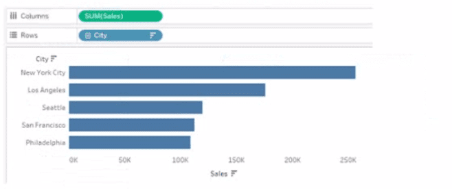
You have a database that includes field named sales, City and Region.
You have the following chart that shows the number of sales made in different cities.
A. Right-click a in the chat, select Annotate and then select Mark.
B. Right-click a bar in the chart select Mark Label and then select Always show.
C. Edit the aliases for City.
D. Drag Region to Tooltip on the Marks card
Explanation
The Tooltip feature in Tableau is specifically designed to display additional, relevant information when a user hovers their mouse over a mark (like a bar, point, or area) on a visualization. To dynamically show the corresponding Region when hovering over a City bar, you must drag the Region field onto the Tooltip shelf on the Marks card. This action embeds the field's value into the pop-up text that appears on hover.
✅ Correct Option: D. Drag Region to Tooltip on the Marks card
✅ Dragging the Region field to the Tooltip shelf on the Marks card is the precise action needed to display that field's value in the pop-up that appears when hovering over a mark. The Marks card controls the appearance and properties of the marks, and the Tooltip shelf manages the information displayed on hover, achieving the required dynamic display of region.
❌ Incorrect Option: A. Right-click a bar in the chart, select Annotate and then select Mark.
❌ The Annotate function is used to add static, persistent text notes directly to a mark on the view, often to highlight a specific data point. It does not dynamically show a field's value on hover; it places a fixed text box that remains visible even when the mouse moves away.
❌ Incorrect Option: B. Right-click a bar in the chart, select Mark Label and then select Always show.
❌ The Mark Label feature is used to display the value of the mark itself (e.g., the Sales total for that bar) or the field on the Label shelf, permanently next to the mark. This is a static label, not a dynamic hover-based tooltip, and it wouldn't automatically include the Region field unless Region was placed on the Label shelf.
❌ Incorrect Option: C. Edit the aliases for City.
❌ Aliases are used to change how a field member's name is displayed in the view without altering the underlying data (e.g., changing "LA" to "Los Angeles"). Editing the alias for City would only change the name of the bar; it would not display a completely different field, Region, on hover.
🌐 Reference:
Format Individual Parts of the View
You have a dashboard that contains confidential information about patients health. The data needs to always be up to date tor a team of healthcare workers. How should you share me dashboard with the healthcare workers?
A. Publish the dashboard to Tableau Public
B. Print the dashboard to PDF
C. Publish the dashboard to Tableau Server
D. Export the dashboard as a .twbx
Explanation
When sharing confidential healthcare data that requires real-time updates, security and data freshness are paramount. The solution must protect sensitive patient information while ensuring the healthcare team always sees the most current data. This eliminates static file formats or public platforms, requiring a secure, managed environment with access controls.
✅ Correct Option
Option C: Publish the dashboard to Tableau Server
This is correct because Tableau Server provides a secure, centralized platform with user authentication and permission controls, essential for protecting confidential patient data. It enables automatic data refresh schedules, ensuring healthcare workers always access the most up-to-date information directly through their web browsers without handling local files.
❌ Incorrect Options
Option A: Publish the dashboard to Tableau Public
This is highly insecure as Tableau Public is an open platform visible to anyone on the internet. Publishing confidential patient health information here would violate privacy regulations like HIPAA and expose sensitive data to unauthorized access.
Option B: Print the dashboard to PDF
This creates a static snapshot that becomes immediately outdated. Healthcare workers would not see real-time data updates, and PDF files can be easily distributed without control, creating security risks for confidential patient information.
Option D: Export the dashboard as a .twbx
This packaged workbook creates a disconnected file that doesn't automatically update. It requires manual distribution and updating, making data freshness impossible to maintain. Additionally, local files are difficult to secure and control once distributed.
📝 Summary
Tableau Server provides the necessary security, access controls, and automatic data refreshes required for confidential, time-sensitive healthcare data.
🔗 Reference
Tableau Help: "Publish Data Sources and Workbooks to Tableau Server"
| Page 4 out of 22 Pages |
| 1234567 |
| Salesforce-Tableau-Data-Analyst Practice Test Home |
Our new timed 2026 Salesforce-Tableau-Data-Analyst practice test mirrors the exact format, number of questions, and time limit of the official exam.
The #1 challenge isn't just knowing the material; it's managing the clock. Our new simulation builds your speed and stamina.
You've studied the concepts. You've learned the material. But are you truly prepared for the pressure of the real Salesforce Certified Tableau Data Analyst exam?
We've launched a brand-new, timed Salesforce-Tableau-Data-Analyst practice exam that perfectly mirrors the official exam:
✅ Same Number of Questions
✅ Same Time Limit
✅ Same Exam Feel
✅ Unique Exam Every Time
This isn't just another Salesforce-Tableau-Data-Analyst practice questions bank. It's your ultimate preparation engine.
Enroll now and gain the unbeatable advantage of:

Copyright © - All Rights Reserved