Total 97 Questions
Last Updated On : 12-Jun-2026
Preparing with Salesforce-Tableau-Data-Analyst practice test 2026 is essential to ensure success on the exam. It allows you to familiarize yourself with the Salesforce-Tableau-Data-Analyst exam questions format and identify your strengths and weaknesses. By practicing thoroughly, you can maximize your chances of passing the Salesforce certification 2026 exam on your first attempt. Start with free Salesforce Certified Tableau Data Analyst sample questions or use the timed simulator for full exam practice. Surveys from different platforms and user-reported pass rates suggest Salesforce Certified Tableau Data Analyst practice exam users are ~30-40% more likely to pass.

You want to add a draft watermark to a dashboard as shown in the following exhibit.
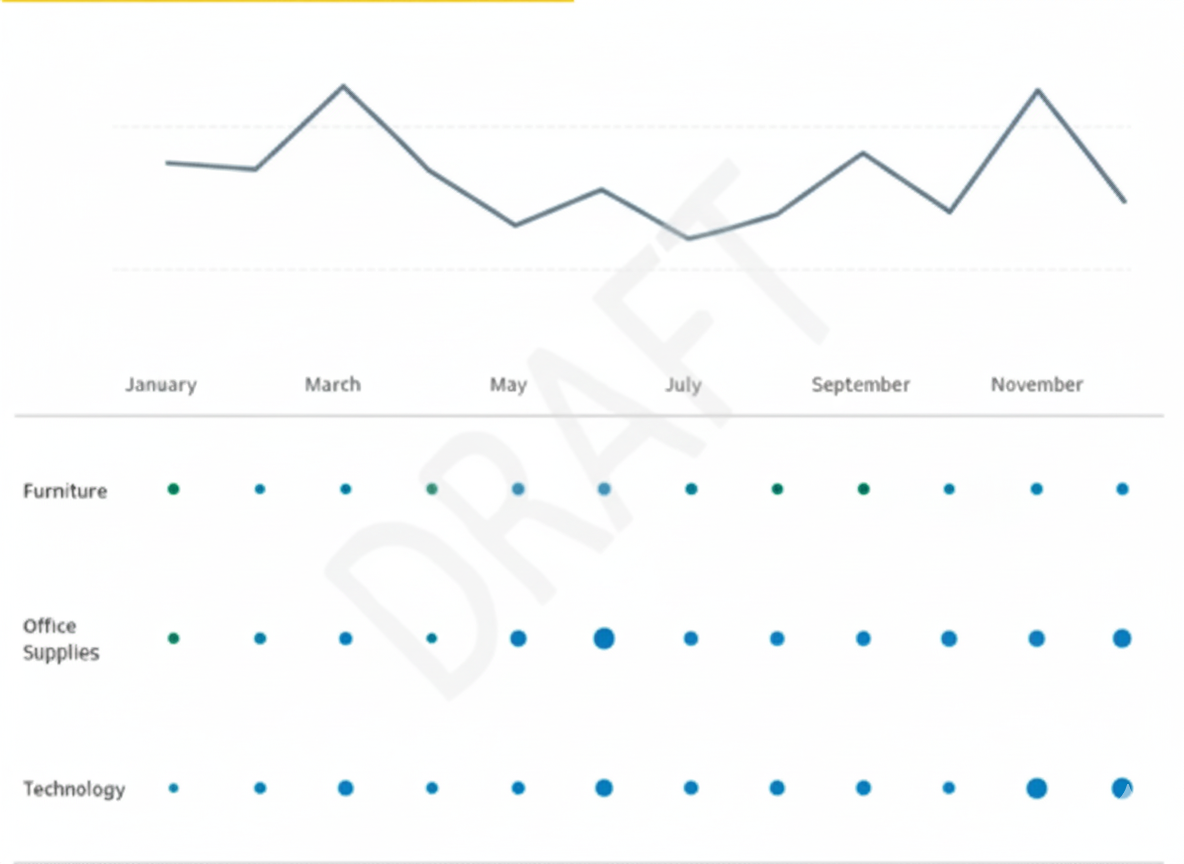
Which type of object should you use?
A. Image
B. Sheet
C. Web page
D. Horizontal
Explanation:
In Tableau, watermarks such as “DRAFT” are static visual elements that must be easily positioned and layered within a dashboard. The Image object is designed for inserting pictures, logos, or text graphics. By floating an image, you can place it behind or over other objects, resize it, and maintain a consistent appearance across dashboards. Other objects like sheets or containers are intended for displaying data or layout management, not static overlays.
Correct Option:
✔️ Image
The Image object is the recommended way to add a watermark. It allows you to upload a graphic (e.g., “DRAFT”) and place it anywhere on the dashboard. You can float it above or below other components, adjust transparency if needed, and ensure it does not interfere with data visualizations. This provides full control over appearance and placement.
Incorrect Options:
❌ Sheet
Sheets are for visualizing data (charts, tables, maps) and are dynamic by nature. Using a sheet to create a watermark is inefficient because you would need to manually format a text visualization, which cannot be layered flexibly like an image. Sheets are not intended for static branding elements.
❌ Web page
A Web Page object embeds online content within the dashboard. While it could theoretically display an image hosted online, it introduces unnecessary complexity, potential load issues, and is difficult to layer. It is not meant for simple static elements like watermarks.
❌ Horizontal
Horizontal objects are layout containers used to organize multiple dashboard components side by side. They cannot display any content themselves, so they cannot be used to show a watermark. Their purpose is purely structural.
Summary:
To add a “DRAFT” watermark in Tableau, the Image object is the correct choice because it is designed for static visuals, allows flexible placement and layering, and ensures the watermark does not interfere with data. Other options like Sheet, Web Page, and Horizontal are either for dynamic content or layout purposes, making them unsuitable for watermarks.
Reference:
Tableau Official Documentation – Create a Dashboard
A Data Analyst has a data source that has two tables named Table1 and Table2. Table1 is the primary table and Table2 is the secondary table.
The analyst wants to combine the tables by using Tableau Prep. The combined table must include only values from Table1 that do not match any values in Table2. The field values from Table2 must appear as null values.
Which type of join should the analyst use?
A. Inner
B. Left only
C. Left
D. Full outer
E. Union
Explanation
The analyst needs to perform an "anti-join" operation, which keeps records from the primary table that have no matching records in the secondary table. In Tableau Prep's join dialog, this is explicitly called a "Left only" join. This join type starts with a Left Join (keeping all records from Table1) and then filters out any records that successfully matched with Table2, leaving only the non-matching rows where all fields from Table2 will be null.
✅ Correct Option
🟢 B. Left only:
This is the specific join type designed for this "anti-join" scenario. It keeps all records from the left table (Table1) that do not have a match in the right table (Table2). For these unmatched records, all columns from Table2 will be populated with null values, exactly as the analyst requires.
❌ Incorrect Options
🔴 A. Inner:
An inner join would return only the records where there is a match between Table1 and Table2. This is the opposite of what is needed, as it would exclude the non-matching records from Table1.
🔴 C. Left:
A standard left join keeps all records from Table1, regardless of whether they match with Table2. Matching records show Table2 data, and non-matching records show nulls. However, this includes both matching and non-matching records, while the requirement is for only the non-matching ones.
🔴 D. Full outer:
A full outer join returns all records from both tables. It will include matching records, non-matching records from Table1, and non-matching records from Table2. This includes much more data than the specified requirement.
🔴 E. Union:
A union is used to stack rows from tables with similar structures on top of each other. It is not a join and cannot be used to horizontally combine tables based on matching keys, making it irrelevant for this scenario.
Summary
A "Left only" join is the precise tool for filtering a primary table to rows that have no corresponding data in a secondary table, resulting in null values for all secondary table fields.
Reference
Tableau Help: Combine Your Data
You have a Tableau workbook that contain three worksheets named Sheet1 Sheet2 and Sheet3.
You create several filters.
From the Data Source page you plan to add data source fillers
When type of filter will appear in the Edit Data Source Filters dialog box?
A. A table calculation filter used on Sheet
B. A top N condition filer on a dimension in Sheet 1 and Sheet2
C. A context filler on a dimension m Sheet3
D. A dimension filter on all the sheets
Explanation
The Edit Data Source Filters dialog box is designed to manage filters that are applied to the entire data connection before any worksheet processing occurs. These filters are global and affect all worksheets using that data source. When you choose to apply a dimension filter from the Filters shelf to "All Using This Data Source," Tableau promotes this filter to the data source level, and it is subsequently listed in the Edit Data Source Filters dialog box.
Options Analysis
✔️ Correct Option: [D] A dimension filter on all the sheets
When an analyst applies a dimension filter on the Filters shelf of a worksheet and changes its scope to "All Using This Data Source," it is automatically recognized and listed in the Edit Data Source Filters dialog box. This is because a filter applied to all sheets using the same source functions as a data source filter, limiting the underlying data before it reaches any view.
❌ Incorrect Option: [A] A table calculation filter used on Sheet
Table calculation filters operate at the very last step of Tableau's Order of Operations, long after the data has been loaded and the view table has been created. They filter what is displayed based on aggregated results, but they do not filter the underlying data source. Therefore, a table calculation filter would never appear in the Edit Data Source Filters dialog.
❌ Incorrect Option: [B] A top N condition filter on a dimension in Sheet 1 and Sheet2
A Top N filter is a type of Dimension filter applied on the Filters shelf. However, it is fundamentally a worksheet-level filter unless its scope is explicitly set to "All Using This Data Source." Even when applied to a select set of sheets like Sheet 1 and Sheet 2, it remains a global filter, which is a separate scope from a true data source filter that applies to all sheets and is listed in the dedicated dialog.
❌ Incorrect Option: [C] A context filter on a dimension in Sheet3
A Context Filter is executed early in the query pipeline, but it is still a worksheet-level filter (or set of filters) designed to work within the confines of a single worksheet's data table before dimension filters are applied. It is not a global filter that applies to all worksheets equally and therefore does not get listed or managed in the Data Source Filters dialog box.
Reference 🔗
Tableau Help: Filter Data from Your Data Source: The official documentation states that when you create a data source filter, any global filters that use that data source are displayed automatically in the Edit Data Source Filters dialog box.
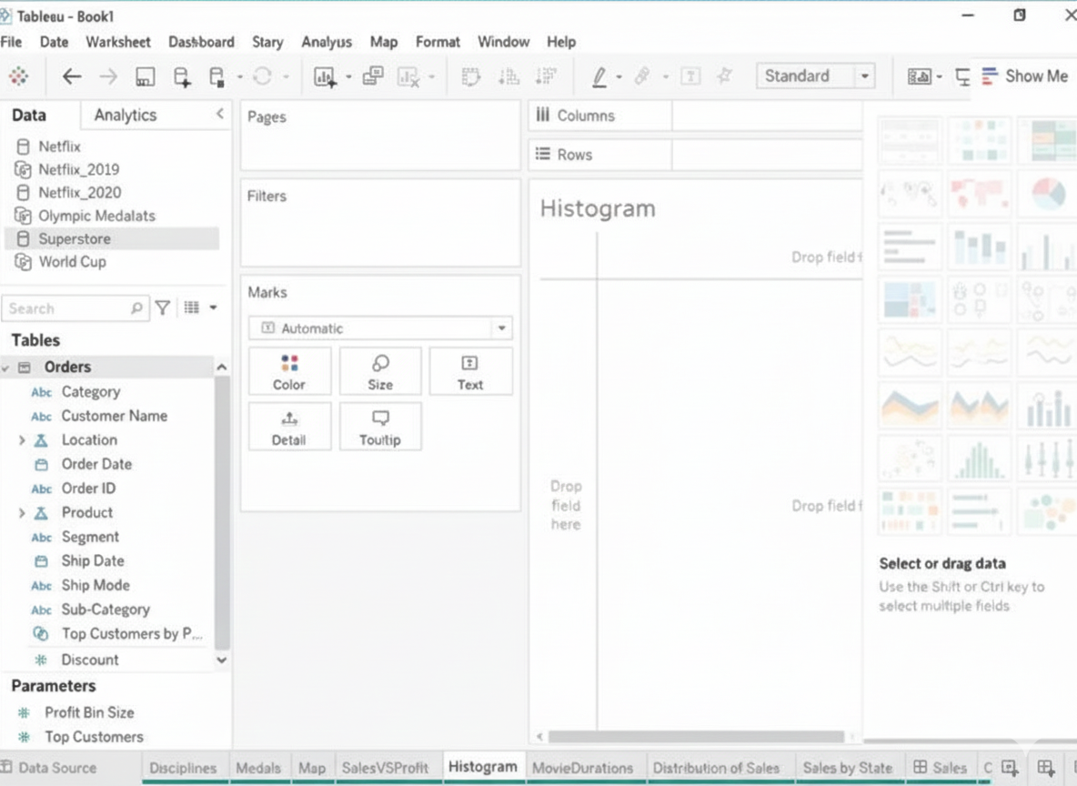
Open the link to Book1 found on the desktop. Open the Histogram worksheet and use the Superstone data source.
Create a histogram on the Quantity field by using bin size of 3.
Explanation:
To create a histogram on the Quantity field by using bin size of 3, you need to do the following steps:
➡️ Open the link to Book1 found on the desktop. This will open the Tableau workbook that uses the Superstore data source.
➡️ Click on the Histogram tab at the bottom of the workbook to open the Histogram worksheet. You will see a blank worksheet with no marks.
➡️ Right-click on Quantity in the Measures pane and select Create Bins from the menu. This will open a dialog box that allows you to create bins for the Quantity field. Bins are groups of values that are treated as one unit in a histogram.
➡️ Enter 3 in the Size of bins text box. This will set the bin size to 3, which means that each bin will contain values that are 3 units apart. For example, one bin will contain values from 0 to 2, another bin will contain values from 3 to 5, and so on.
➡️ Click OK to create the bins. You will see a new field named Quantity (bin) in the Measures pane with a # sign next to it.
➡️ Drag Quantity (bin) from the Measures pane to Columns on the worksheet. This will create a histogram that shows the distribution of Quantity by bins. You will see bars that represent the frequency or count of values in each bin.
Optionally, you can adjust the width, color, and labels of the bars by using the options on the Marks card. You can also add filters, tooltips, or annotations to enhance your histogram.
🔗 Reference:
➡️ Create Bins from a Continuous Measures
You have a Tableau workbook.
You want to make the workbook available in Tableau Online.
What should you do?
A. From the Server menu, select Tableau Public, and then select Save to Tableau Public.
B. From the File menu, select Export Packaged Workbook.
C. From the Server menu, select Publish Data Source.
D. From the Server menu, select Publish Workbook.
Explanation
Tableau Online is a secure, organization-owned cloud site where workbooks need to be actively uploaded from Tableau Desktop so that colleagues can view, interact with, or edit them through a browser. The publishing process also handles permissions, projects, data-source embedding, and extract refreshes in one seamless step.
Correct Option
✅ D. From the Server menu, select Publish Workbook
This is the direct and complete way to get a workbook onto Tableau Online. Choosing Server → Publish Workbook opens a dialog that lets you select your Tableau Online site, pick the target project, set permissions, decide whether to embed credentials or publish the data source separately, and include extracts. After clicking Publish, the entire workbook (dashboards, sheets, stories, formatting) instantly becomes available online.
Incorrect Options
❌ A. From the Server menu → Tableau Public → Save to Tableau Public
Tableau Public is a completely separate free service designed for openly sharing visualizations with the entire internet. Workbooks published there are visible to anyone in the world, downloadable, and cannot be made private later. This has nothing to do with Tableau Online and would expose potentially sensitive data.
❌ B. From the File menu → Export Packaged Workbook
This only saves a .twbx file to your local drive. It bundles everything into a single package for sharing via email or file transfer, but the workbook never reaches Tableau Online automatically. Someone would still need to manually upload the .twbx through the web interface, losing the smoother publishing features (permissions, scheduling, version history).
❌ C. From the Server menu → Publish Data Source
Publishing the data source alone uploads only the connection or extract, not the visualizations. Colleagues on Tableau Online would see the data source in their list, but your carefully designed dashboards, layouts, calculated fields in the workbook context, and formatting would remain on your computer and never appear online.
Reference
Simple Steps to Publish a Workbook
You have the following dataset. You want to create a new calculated dimension field named Category that meets the following conditions:
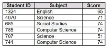
➡️ When Subject is Computer Science or Science, Category must be Sciences.
➡️ When Subject is English or Social Studies, Category must be Humanities.
Which two logical functions achieve the goal? Choose two.
A. IF [Subject]- 'Science' THEN 'Sciences'
ELSEIF [Subject]='English' THEN 'Humanities'
ELSEIF [Subject]-'Social Studies' THEN 'Humanities'
ELSEIF [Subject]= 'Computer Science' THEN 'Sciences'
END
B. IIF(( CONTAINS ([Subject], 'Science') = TRUE) , 'Humanities', 'Sciences')
C. IF ENDSWITH ( [Subject], 'Computer Science') THEN 'Sciences' ELSE 'Humanities' END
D. CASE [Subject]
WHEN 'Computer Science' THEN 'Sciences'
WHEN 'Science' THEN 'Sciences'
WHEN 'English' THEN 'Humanities'
WHEN 'Social Studies' THEN 'Humanities'
End
Explanation
To create a calculated dimension that classifies subjects into Sciences or Humanities, Tableau provides logical functions like IF/ELSEIF and CASE. These allow testing multiple conditions and assigning values accordingly. Using functions that rely solely on string matching (like CONTAINS or ENDSWITH) may not cover all required cases accurately. The goal is to map exact subject names to their corresponding category consistently.
✔️ Correct Options
A. IF / ELSEIF
This function checks each condition in order. It explicitly assigns:
'Science' → Sciences
'Computer Science' → Sciences
'English' or 'Social Studies' → Humanities
This ensures all subjects are mapped correctly. The order of ELSEIF statements allows multiple conditions to be checked sequentially.
D. CASE
The CASE function directly maps exact values of [Subject] to categories:
'Computer Science' & 'Science' → Sciences
'English' & 'Social Studies' → Humanities
It is concise, readable, and avoids errors that can occur with complex nested IF statements.
❌ Incorrect Options
B. IIF with CONTAINS
This checks if the string contains “Science” and then assigns values. However, it incorrectly maps “Science” subjects to Humanities instead of Sciences and cannot handle multiple subjects like Social Studies or English. It is not suitable for exact matching of multiple conditions.
C. IF ENDSWITH
Using ENDSWITH only evaluates whether the subject ends with a specific string. “Science” and “Computer Science” would be handled differently, and English or Social Studies would be incorrectly classified. This method does not fully satisfy the mapping rules.
📎 Reference
Tableau Help – Logical Functions (IF, ELSEIF, CASE)
https://help.tableau.com/current/pro/desktop/en-us/functions_functions.htm
You have a Tableau workbook that has a live data source. The data source connects to a Microsoft SQL Server database. Only the users in your department can access the database.
You plan to publish the workbook to a Tableau Server site named Public. All the users in your company can access Public.
What are two ways to ensure that all the users can view the worksheets in the workbook? Choose two.
A. Change the data source to an extract before you publish.
B. Embed the credentials when you publish the workbook.
C. Remove all the data source filters before you publish.
D. Export the data to a .csv before you publish.
E. Configure the local file permissions to the workbook file, and then publish the workbook.
Explanation
The workbook uses a live SQL Server connection that only your department can access. When you publish it to a Tableau Server site (Public) where everyone can view it, users who don’t have database access will not be able to see the data unless you either extract the data or embed credentials so Tableau authenticates on their behalf.
🟩 Correct Option A: Change the data source to an extract before you publish
Using an extract copies the data into Tableau Server instead of relying on the live SQL Server connection. Since the extract no longer requires direct database access, all users who can access the workbook can view the data. This removes dependency on SQL Server permissions and ensures wide access while maintaining performance benefits of extracts.
🟩 Correct Option B: Embed the credentials when you publish the workbook
When you embed credentials, Tableau Server uses those credentials to connect to the SQL Server database, even if users do not have database access. This allows every user to view the workbook without requiring access privileges to the underlying database. It keeps the live connection functional and secure while providing shared access to the visualizations.
❌ Incorrect Option C: Remove all the data source filters before publishing
Removing filters does not affect database security or connectivity. Users still wouldn’t be able to see the data without access to SQL Server. Filters only control data visibility on Tableau, not access to the underlying source, so this does not solve the permission issue.
❌ Incorrect Option D: Export the data to a .csv before publishing
Exporting to a CSV breaks the connection and workflow, requiring new data imports for every update. It also removes the advantages of using Tableau Server data refreshes, automation, and secure handling of data. This is not a recommended or scalable way to share data on Tableau Server.
❌ Incorrect Option E: Configure the local file permissions to the workbook
Changing file permissions on the local workbook before publishing does not control data access once it is hosted on Tableau Server. Tableau Server permissions and data source credentials determine access, so modifying local file access has no impact on server access to the database.
📝 Summary
To ensure everyone can view the workbook on Tableau Server Public, you must either embed database credentials or convert the live connection to an extract. These choices enable access even for users who cannot connect to SQL Server.
🔗 Reference
Tableau Server Data Authentication (Official Documentation):
https://help.tableau.com/current/server/en-us/datasource_permissions.htm
You have the Mowing two tables that contains data about the books in a library.
Both tables are incomplete so there are books missing from the tables.
You need to combine the tables. The solution must ensure that all the data is retained.
Which type of join should you use?
A. Full outer join
B. Right join
C. left join
D. Inner join
Explanation:
In this scenario, you are working with two incomplete tables, each containing partial data about books in a library. Since some books exist only in one table and not in the other, and your goal is to retain all data from both tables (no matter where the data resides), you need to use a join that captures everything.
A full outer join is the only join type that ensures:
➡️ All rows from Table A are included
➡️ All rows from Table B are included
➡️ When there's a match on a key (e.g., Book ID), data from both tables is combined
➡️ When there’s no match, rows from one table are still included, with null values for the missing columns from the other
This guarantees nothing is excluded—making it perfect when you’re combining incomplete datasets and need full coverage.
❌ Why other options are incorrect:
B. Right join: Only retains all rows from the right table, and matching rows from the left table. If the left table has unique records, they will be lost.
C. Left join: Retains all rows from the left table, and matching rows from the right. Records unique to the right table are excluded.
D. Inner join: Only includes rows where there is a match in both tables. Any unmatched rows in either table will be dropped—not acceptable if you want full data retention.
📘 Tableau Reference:
"A full outer join combines the results of both left and right outer joins. All records from both tables are included in the result set, with matches where possible and NULLs where no match is found."
🔗 Tableau Docs – Join Types
A colleague provides a Data Analyst with access to a folder that has the following files:
Sales.csv
Book1.json
Sales.tds
Export.mdb
Which file can contain information for connecting to an external data source, such as an SQL Server database?
A. Sales.csv
B. Sales.tds
C. Export.mdb
D. Book1.json
Explanation
The file extension .tds stands for Tableau Data Source. This is a proprietary Tableau file type designed to save the connection information to data, without saving the actual data itself. A .tds file stores details like the database server name (e.g., SQL Server), port, credentials (or prompt for them), and any customized settings, folders, calculations, or hierarchies applied within Tableau. This file type is specifically used to share and reuse a standardized connection setup.
✅ Correct Option: B. Sales.tds
The .tds (Tableau Data Source) file is an XML file created by Tableau Desktop. Its primary function is to store the full definition of a data connection, including the type of database (e.g., SQL Server), server address, authentication requirements, and any metadata customizations specific to Tableau. It acts as a shortcut or template, allowing an analyst to easily reconnect to the external data source without having to rebuild the connection from scratch.
❌ Incorrect Option: A. Sales.csv
A .csv (Comma Separated Values) file is a plain text file that contains the raw, delimited data itself. It does not contain any connection information to an external, live data source like an SQL Server database. The data within a CSV is already static and local to the file, and it is not designed to maintain a dynamic connection.
❌ Incorrect Option: C. Export.mdb
A .mdb file is a file format used by Microsoft Access Database. While it is a database that contains both data and database objects, it is a local, file-based database. It does not contain the connection instructions for a separate, external SQL Server database, which is typically accessed via an ODBC/JDBC driver and a .tds or similar connection file.
❌ Incorrect Option: D. Book1.json
A .json (JavaScript Object Notation) file is a standard text-based format for transmitting and storing data, often used by web applications. Similar to a CSV, a JSON file contains the raw data itself, structured in key-value pairs. It does not contain the necessary connection instructions, drivers, or metadata to establish a live connection to an external SQL Server database.
📚 Reference
You can find the official documentation for Tableau file types:
Tableau Help: Tableau File Types and Folders
You have a line chart on a worksheet.
You want to add a comment to March 2020 as shown in the following visualization.
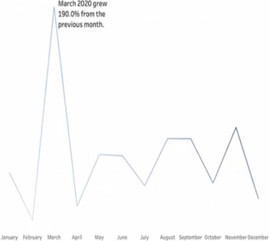
What should you do?
A. Drag the growth rate to Text on the Marks card
B. Enable captions
C. Annotate March 2020
D. Add a tooltip
Explanation:
To add a specific comment to a data point—like March 2020 on a line chart—you use annotations in Tableau. An annotation allows you to call out important events, outliers, or milestones directly on the chart. In this case, you might want to highlight something significant that happened in March 2020 (e.g., a drop in sales due to COVID-19).
To do this:
➡️ Right-click on the data point for March 2020 in the line chart.
➡️ Select "Annotate" → choose "Mark", "Point", or "Area" depending on the context.
➡️ Enter your comment in the annotation box that appears.
This will visually anchor the note to that specific part of the chart, making it clear and informative for viewers.
❌ Why the other options are incorrect:
A. Drag the growth rate to Text on the Marks card: This would display numerical values as labels on the chart, not explanatory comments. It’s for data labeling, not annotation.
B. Enable captions: Captions add a description below the chart for the whole worksheet—not for a specific data point. This wouldn’t help you comment on just March 2020.
D. Add a tooltip: Tooltips appear on hover, not as visible comments on the chart. Also, they don’t persist unless the user interacts with the chart.
📘 Tableau Reference:
"You can annotate a point, an area, or a mark to help explain data in your view."
🔗 Tableau Docs – Annotate Views
| Page 1 out of 10 Pages |
| 123 |
Our new timed 2026 Salesforce-Tableau-Data-Analyst practice test mirrors the exact format, number of questions, and time limit of the official exam.
The #1 challenge isn't just knowing the material; it's managing the clock. Our new simulation builds your speed and stamina.
You've studied the concepts. You've learned the material. But are you truly prepared for the pressure of the real Salesforce Certified Tableau Data Analyst exam?
We've launched a brand-new, timed Salesforce-Tableau-Data-Analyst practice exam that perfectly mirrors the official exam:
✅ Same Number of Questions
✅ Same Time Limit
✅ Same Exam Feel
✅ Unique Exam Every Time
This isn't just another Salesforce-Tableau-Data-Analyst practice questions bank. It's your ultimate preparation engine.
Enroll now and gain the unbeatable advantage of:
Copyright © - All Rights Reserved