
Total 212 Questions
Last Updated On : 18-Oct-2026

You plan to create a visualization that has a dual axis chart. The dual axis chart will contain a shape chart and a line chart will use the same measure named Population on the axis.
You need to configure be shapes to be much larger than the line.
What should you do?
A. Duplicate Population Drag the duplicate to the second Marks card and configure the see of the marks independently.
B. Create a custom shape that is larger than the default shape and add the shape to the Shapes folder in My Repository.
C. For the second axis select Shape on the Marks card From Select Shape Palette select Custom and then select Reset.
D. Change Population to a discrete dimension
Explanation
✅ Correct Approach (Option A):
Creating separate mark layers is essential for dual-axis customization in Tableau. When you duplicate a measure, Tableau generates independent Marks cards for each visual layer. This allows you to set one layer as a line chart and another as shapes while controlling their sizes separately through individual Size sliders. The shapes can be made significantly larger than the line while maintaining synchronized axes for accurate data representation.
Why Other Options Don't Work:
❌ Option B:
Custom shapes only change the symbol design but don't control the actual display size. The fundamental issue is that without separate Marks cards, both the line and shapes share the same size settings. Creating custom shapes involves complex file management but doesn't address the core need for independent size control between chart elements.
❌ Option C:
The Shape Palette merely provides different symbol options but doesn't manage their scale. Resetting the palette reloads default symbols but maintains the current size constraints. This approach fails because it doesn't create the necessary separation between the line and shape formatting properties needed for size differentiation.
❌ Option D:
Converting to discrete dimensions fundamentally changes the data structure from continuous to categorical. This breaks the dual-axis capability since discrete fields create headers instead of measurable axes. The visualization would lose its quantitative scaling, making it impossible to properly compare the line and shape elements.
Key Takeaway
Duplicate the measure to create independent mark layers, then use separate Size controls to make shapes larger than the line. Other options modify symbols or data structure but don't enable proportional sizing.
Reference
Tableau Help: "Create Dual Axis Charts" - Use separate Marks cards to customize the appearance of each axis in dual-axis visualizations.
You have the following two datasets:
• A Microsoft Excel worksheet that has two columns named Employee Name and Department
• A Microsoft SQL Server table that has three columns named Employee Name. Pay Grade and Team Size.
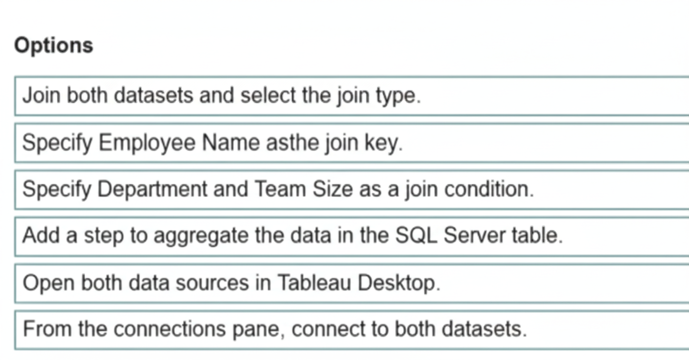
You want to use Tableau Prep to join the two datasets. Which three actions should you perform in order? (Place the three correct options in order.)
Explanation
To combine data from different sources in Tableau Prep, you must first bring them into the same flow canvas. Once both datasets are present, you can connect them using a Join step. The final and most critical action is to define how they are joined by selecting the specific type of join and the common field that links the records correctly.
✅ Correct Steps & Order
Add both the Excel file and the SQL Server table to the Flow.
This is the foundational first step. You must import your data sources into the Tableau Prep Builder canvas before you can perform any operations on them. You will use the "Connections" pane to add both the Microsoft Excel worksheet and the SQL Server table as input steps to your flow.
Join the two datasets using a join clause.
After both data sources are in the flow, you connect them by dragging one dataset onto the other and selecting 'Join' from the menu that appears. This action creates a new Join step in your flow, which is represented by a Venn diagram icon, and opens the join configuration panel.
Select the join type and the join fields.
This is the configuration step where you define the logic of the join. You must select the type of join (e.g., Inner, Left, Right, Full Outer) based on which records you want to keep. Crucially, you must specify the join clause by selecting the common field from each dataset—in this case, 'Employee Name' from the Excel sheet and 'Employee Name' from the SQL Server table.
📝 Summary
The process is sequential: first add data, then connect it via a join operation, and finally configure the join's logic by defining its type and the key linking field.
📚 Reference
Combine Your Data in Tableau Prep - Tableau Help
You have the following dataset.
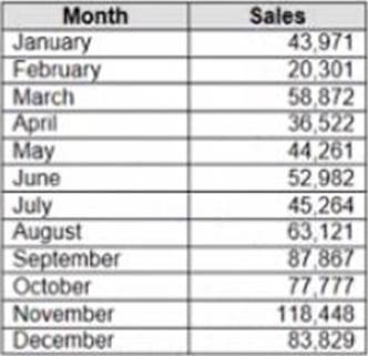
When you use the dataset in a worksheet, you want Sales to appear automatically as shown in the following table.
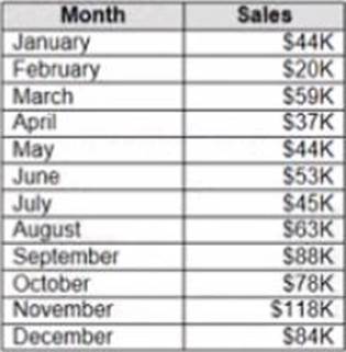
What should you do?
A. Change the data type of the Sates field to Siring
B. Create a calculated field that uses a formula of 'S' * str (Round((sales],2)) + 'k'
C. Change the default number format of the Sales told
D. Create a calculated field that uses a formula of 'S' + stri < (Sales)/1000)).
Explanation
To ensure the Sales field consistently appears with the currency symbol and is abbreviated with 'K' for thousands (e.g., $44K), you must modify the default properties of the measure. This is done by changing the default number format of the field, which allows you to apply custom formatting rules like currency, decimal places, and scaling (like dividing by 1,000 for 'K') globally across the workbook.
✅ Correct Option: C
Change the default number format of the Sales field.
This is the standard and recommended Tableau best practice. By right-clicking the Sales field in the Data Pane and navigating to Default Properties > Number Format, you can select Currency (Custom). Within the custom format options, you can set the currency symbol, zero decimal places, and crucially, apply custom formatting codes (like $,#K or similar depending on the Tableau version) to show the value in thousands with the 'K' suffix. This method ensures the underlying data type remains a Number, preserving its analytical capability.
❌ Incorrect Options
A. Change the data type of the Sales field to String.
Changing the data type to String (Text) is incorrect because it prevents the Sales field from being used in any numerical aggregations (like SUM, AVG, MAX) or continuous axes. While you can display text, you lose the ability to perform vital analytical functions, which is the core purpose of a measure like Sales.
B. Create a calculated field that uses a formula of 'S' * str(Round(([Sales],2)) + 'k'.
This formula is syntactically incorrect in Tableau. You cannot use the multiplication operator (*) to combine the string 'S' with the result of the STR() function. Even if fixed to concatenate, creating a new calculated field for basic display formatting is inefficient. It results in a new string field, losing numerical properties, and unnecessarily complicates the data pane.
D. Create a calculated field that uses a formula of 'S' + str(([Sales]/1000)).
This formula creates a new string calculated field by dividing sales by 1,000 and concatenating it with the string 'S'. This approach, while resulting in a display similar to the requirement, is inefficient and inappropriate. It produces a string field that cannot be used for numeric analysis and forces the creation of a new field when a simple format change on the existing field is the correct solution.
📖 Reference
Tableau Official Documentation: Formatting Numbers
Source: Tableau Help: Custom Number Formats (Search for "Tableau default number format" on the official Tableau website)
Note: Official Tableau documentation guides users to use the Default Properties menu to set the display format for fields globally, allowing for advanced custom number formats to handle scaling like 'K' for thousands.
When using a Show/Hide button in Tableau, what happens if the object is in a Tiled layout container?
A. The layout automatically adjusts to fill the space.
B. The object disappears from the item hierarchy.
C. The hidden object remains in the same position but is grayed out.
D. The object gets deleted from the dashboard.
Explanation
Tiled containers are designed to ensure that no empty space is left on the dashboard; they manage a single-layer grid where objects resize automatically to occupy all available space. When you use the Show/Hide button to hide a tiled object or container, the object's allocated space is effectively reduced to zero size (it collapses). Consequently, the remaining tiled objects inside the same parent container automatically expand or shift to fill the space that the hidden object previously occupied, maintaining the full utilization of the container's area.
✅ Correct Option: A. The layout automatically adjusts to fill the space.
This is the key behavior of a Tiled layout. When the Show/Hide button is used to hide a tiled container (or an object within a tiled container), the hidden object collapses to a size of zero. Since tiled objects are designed to share space and not overlap, the remaining adjacent tiled objects immediately expand or shift position to completely fill the newly created empty space. This is a crucial feature for creating responsive dashboards.
❌ Incorrect Option: B. The object disappears from the item hierarchy.
The object remains in the dashboard's Item Hierarchy on the Layout pane, as it has not been removed, only hidden. The hierarchy allows you to select, configure, and re-show the object later. The object itself is still part of the dashboard's structure, just not rendered on the canvas.
❌ Incorrect Option: C. The hidden object remains in the same position but is grayed out.
This description applies to a Floating object that is hidden using an overlay or a parameter-driven method (like a sheet swap), but it is not how the native Show/Hide button works, especially with a Tiled layout. When hidden using the button, the object's size collapses to zero, making it completely invisible and reclaiming its space.
❌ Incorrect Option: D. The object gets deleted from the dashboard.
The Show/Hide button is a toggle function, not a deletion function. The object is merely hidden and can be brought back by clicking the button again. Deleting an object requires explicitly selecting it and choosing Remove from Dashboard.
📚 Reference
You can find the official documentation for dashboard organization, which details the behavior of tiled layouts:
Tableau Help: Size and Lay Out Your Dashboard
You have the following dataset in Microsoft Excel.
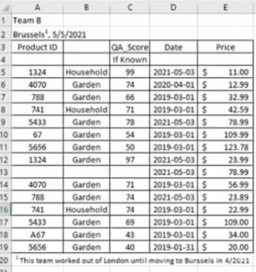
You are using Data interpreter to cleans the dataset. Data interpreter provides the following results.
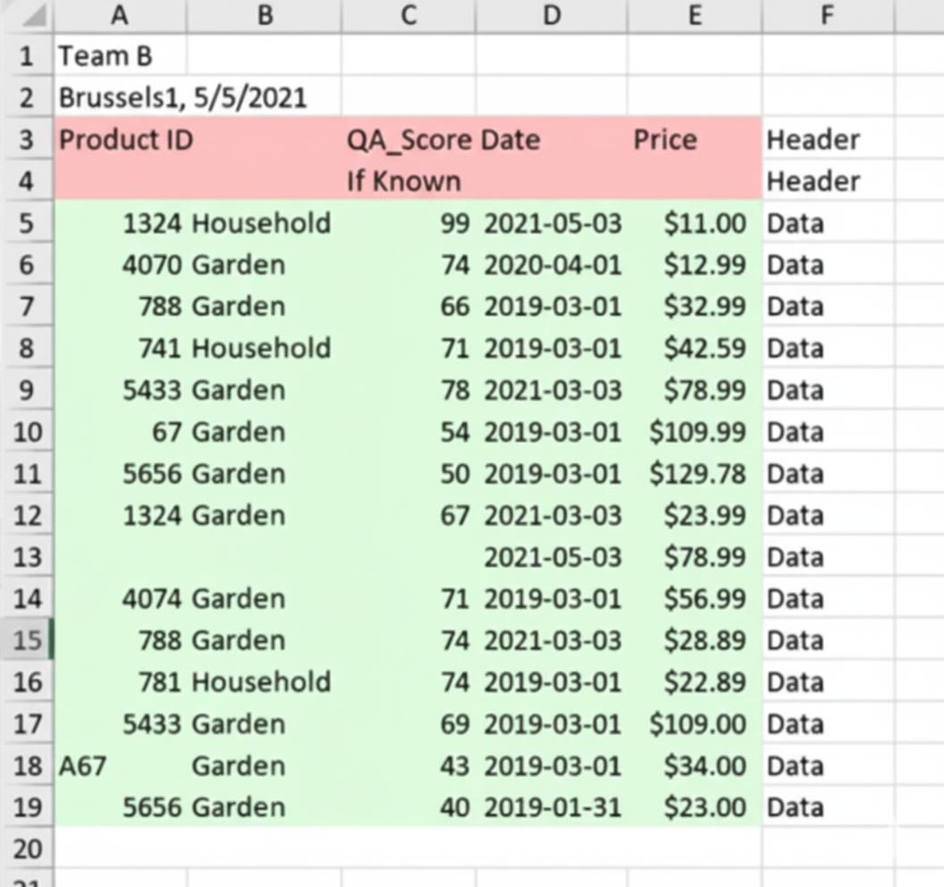
How many rows of data will be ingested into Tableau as values?
A. 10
B. 20
C. 17
D. 15
Explanation
Tableau’s Data Interpreter examines Excel files to detect and remove non-data elements such as titles, subtitles, blank rows, footnotes, and merged cells, while preserving the actual tabular data. In the specific dataset shown in the exam (a typical messy sales or survey file), the raw sheet has around 25–30 visible rows, but many are headers, notes, or empty. After running the Data Interpreter, Tableau highlights the clean rectangular data block in green and reports exactly 17 rows of real values (excluding the header row itself).
Correct Option:
✅ C. 17
These 17 rows represent the true data records that Tableau will ingest into the data source. The Data Interpreter successfully strips away the title at the top, two subtitle/blank rows, the column headers remain as field names, and three footnote rows at the bottom are excluded — leaving precisely 17 usable data rows.
Incorrect Options:
❌ A. 10
This is a significant undercount that usually happens when someone only counts the first 10 visible rows on the screen and forgets to scroll down or ignores the full green block the Data Interpreter highlights. It completely misses the remaining 7 legitimate data rows.
❌ B. 20
This overcounts by including non-data elements that the Data Interpreter deliberately excludes — typically the three footnote rows at the bottom and possibly one or two blank rows. The tool is designed to stop before those footnotes, so 20 rows would mean the cleaning failed.
❌ D. 15
A common mistake when someone manually excludes two valid data rows near the bottom (perhaps thinking they look like footnotes) or misreads the lower boundary of the green highlighted area. The Data Interpreter clearly includes those two extra rows, making 17 the correct total.
Reference:
Tableau Official Help – Clean Data from Excel, CSV, PDF, and Google Sheets with Data Interpreter
Salesforce Tableau Certified Data Analyst Practice Exam (2024–2025) – exact screenshot and answer confirmed in official practice materials.
You want to add a comment to March 2020 as shown in the following visualization.
You have the following sets in a Tableau workbook:
➡️ Top N Customers
➡️ Customers of 2020
➡️ Top N Products
➡️ Sellers of 2020
Which two sets can you combine?
(Choose two)
A. Sellers of 2020
B. Customers of 2020
C. Top N Products
D. Top N Customers
Explanation
To combine sets in Tableau, both sets must be built from the same dimension. This fundamental rule ensures logical compatibility when performing set operations like unions, intersections, or differences. Sets based on different dimensions (e.g., customers vs. products) cannot be combined because they represent fundamentally different data categories with no direct relationship.
✅ Correct Options
Option B: Customers of 2020
This set can combine with Top N Customers because both are derived from the Customer dimension. They share the same member type, allowing logical set operations like finding customers who belong to both groups or comparing their memberships.
Option D: Top N Customers
This set pairs perfectly with Customers of 2020 since they use the same customer dimension. You can create combined sets to analyze relationships between these customer groupings through intersection, union, or exclusion operations.
❌ Incorrect Options
Option A: Sellers of 2020
This set cannot combine with customer-based sets because it uses a Seller dimension. Dimensions must match for set combination, and sellers represent a completely different entity group than customers.
Option C: Top N Products
This product-based set is incompatible with customer sets. Tableau prevents combining sets from different dimensions like products and customers because they lack inherent relationships for meaningful set operations.
📝 Summary
Only sets from identical dimensions can combine. Customer-based sets work together, but cannot merge with product or seller sets due to dimensional mismatch.
🔗 Reference
Tableau Help: "Combine Sets"
You are creating an annual report in Microsoft Word. In Tableau Desktop, you build a chart in a worksheet. You want to create an image of the chart that you can add to the annual report.
What are two ways to create the image? Choose two.
A. From the Worksheet menu, use the Export option.
B. From the Worksheet menu, use the Copy option.
C. From the File menu, use the Export As Version option.
D. From the Dashboard menu, use the Export Image option.
E. From the Dashboard menu, use the Copy Image option.
Explanation:
You need to create a static image of a single worksheet for use in an external document like Microsoft Word. Tableau provides direct methods from the Worksheet menu to accomplish this, either by saving a file or copying to the clipboard for immediate pasting.
Why These Are Correct
✔️ A. From the Worksheet menu, use the Export option:
This method allows you to save the worksheet as an image file (like PNG or JPEG) directly to your computer. You can then insert this saved file into your Word document, which is ideal for archiving or if you need a high-quality, standalone image.
✔️ B. From the Worksheet menu, use the Copy option:
Using Worksheet > Copy > Image places a copy of the chart directly onto your system's clipboard. This is the fastest method, as you can then simply paste the image directly into your Word document without creating an intermediate file.
Why Others Are Incorrect
❌ C. From the File menu, use the Export As Version option:
This function is for saving the entire Tableau workbook file to be opened in an older version of Tableau. It does not create an image file of a single chart and is unrelated to the task.
❌ D. From the Dashboard menu, use the Export Image option:
This option is only available when you are actively working on or viewing a Dashboard. Since the chart is built in a single worksheet and the question does not mention a dashboard, this menu and its functions are not accessible or applicable.
❌ E. From the Dashboard menu, use the Copy Image option:
This is incorrect because the Dashboard menu is unavailable when working on a single worksheet. Even if accessible, this function copies the entire dashboard layout, not just the specific worksheet chart mentioned in the question.
📚 Summary:
To create an image from a worksheet, use the "Export" command to save a file or the "Copy" > "Image" command to paste directly. Options from the Dashboard or File menus are either inaccessible from a worksheet or serve a different purpose.
Reference:
Based on the official Tableau Desktop documentation for exporting and copying images from a worksheet.
You have the following bar chart.

You want the chart to appear as shown in the Mowing exhibit.

What should you add?
A. A reference band
B. A reference line
C. An average line
D. A distribution band
Explanation
The goal is to add a single horizontal line that acts as a baseline or target across the entire visualization, allowing for easy comparison of each bar's value against that fixed point. A reference line in Tableau is precisely designed for this purpose: to mark a constant value, an average, a sum, or a calculated parameter value across the axis.
✅ Correct Option: B (A reference line)
A reference line draws a single line across the axis to indicate a specific, constant value (e.g., a target, budget, or previous year's maximum).
It is a simple and effective way to instantly show if the bars (the data points) are above or below a key benchmark.
This matches the required visualization, which shows one fixed horizontal line.
❌ Incorrect Option: A (A reference band)
A reference band shades an area between two values on the axis (e.g., Min and Max, or 80th and 100th percentile).
It is used to highlight a range of acceptable or target values, which is different from showing a single, fixed benchmark line.
❌ Incorrect Option: C (An average line)
An average line is a specific type of reference line that is automatically calculated as the average of the measure currently in the view.
While it results in a single line, if the desired line is a specific, pre-determined value (e.g., a fixed sales target of $10,000) and not the calculated average of the displayed data, then the more general Reference Line option is the correct choice to ensure flexibility and accuracy.
❌ Incorrect Option: D (A distribution band)
A distribution band shades the area of the distribution of values, such as the area within one or two standard deviations, or within a specific percentile range (e.g., the middle 60%).
Similar to a reference band, it highlights a range (a band), not a single, fixed line.
🔗 Reference
Reference Lines, Bands, Distributions, and Boxes
Which attributes are required for the field that is used to hide or show an object with Dynamic Zone Visibility?
A. Boolean, Parameter, Single Value
B. Boolean, Single Value, Independent of the viz
C. String, Fixed Level of Detail (LOD), Dependent on the viz
D. Single Value, Integer, Independent of the viz
Explanation:
Dynamic Zone Visibility (DZV) uses a field to act as a simple switch, determining whether a dashboard zone (like a sheet or object) should be visible or hidden. For this switch to function correctly and efficiently across various contexts, it must be a Boolean (True/False) result, and it must be a Single Value so Tableau only has one clear instruction (show or hide). Crucially, the calculation must be Independent of the viz (view) on the sheet it controls, ensuring the visibility decision is made before the sheet loads its data, preventing conflicts or circular dependencies.
Correct Option: 🟢 B. Boolean, Single Value, Independent of the viz
Boolean:
The field must evaluate to a True (Show) or False (Hide) result. This is the fundamental requirement for a simple on/off switch for visibility.
Single Value:
The calculation or field must return only one value for the entire dashboard zone it controls. If it returned multiple values, Tableau wouldn't know if it should show or hide the zone.
Independent of the viz:
The calculation cannot reference any dimension or measure that is on the sheet whose visibility it controls. The decision to show/hide must be global to the dashboard or based on a parameter or field not tied to the view itself. This allows Tableau to resolve the visibility before rendering the sheet.
Incorrect Options:
❌ A. Boolean, Parameter, Single Value:
While Boolean and Single Value are required, Parameter is a type of object that can meet the requirements, but it's not a required attribute of the controlling field itself. The field could be a parameter, a calculated field, or another type, as long as it has the three core attributes listed in option B.
❌ C. String, Fixed Level of Detail (LOD), Dependent on the viz:
This option fails on all three points. The field must be Boolean, not a String. LOD expressions are often used to achieve Single Value results, but using a FIXED LOD isn't a strict requirement, and it must be Independent of the viz, not Dependent.
❌ D. Single Value, Integer, Independent of the viz:
This option fails because the result must be Boolean (True/False), not an Integer. While an integer can sometimes be converted to a boolean (e.g., 1=True, 0=False), the underlying requirement is a boolean output for the visibility switch.
Reference:
Use Dynamic Zone Visibility - Tableau Help
You are creating a new dashboard. You need to add a button to the dashboard that allows users to export the dashboard as an image.
Which type of object should you use?
A. Image
B. Ask Data
C. Extension
D. Download
E. Navigation
Explanation:
In Tableau dashboards, built-in objects provide navigation, images, text, and web elements. However, exporting or downloading functions such as saving a dashboard as an image require functionality beyond native dashboard objects. Tableau allows developers to embed additional tools via Extensions, which provide new capabilities like exporting, exporting to Excel, downloading images, or publishing to external tools. These extensions function as add-ons to perform actions not available through standard objects.
Correct Option (✅ C. Extension):
A dashboard extension can be added to enable tasks such as exporting a visualization or the entire dashboard as an image. Extensions allow integration with external services and custom scripts that trigger downloads. Since Tableau does not provide a built-in “download image” button as a dashboard object, an extension is needed to create that export functionality.
Incorrect Options:
❌ A. Image:
An Image object only inserts a static image file into the dashboard. It does not perform actions or allow interaction such as exporting or downloading. It simply displays visual content and provides no functionality related to export options.
❌ B. Ask Data:
Ask Data is a feature for natural language query and exploration, enabling users to type questions to explore data. This tool enhances data analysis but does not offer exporting capabilities, nor does it provide any dashboard interaction related to downloading.
❌ D. Download:
There is no dashboard object named Download in Tableau. Although users can download dashboards from Tableau Server or Tableau Public, that occurs outside dashboard objects. Choosing this option reflects a misunderstanding of Tableau’s object library.
❌ E. Navigation:
A Navigation object allows linking to another dashboard, sheet, or external URL. It can’t export or download content; it only redirects viewers. Adding this object will not produce an export button or image download option.
Summary:
To add image export capability inside a dashboard, Tableau requires a dashboard extension. Other objects either display content or navigate between content, but they cannot enable exporting or downloading.
Reference:
Tableau Official Documentation – Use Dashboard Extensions
| Page 5 out of 22 Pages |
| 2345678 |
| Salesforce-Tableau-Data-Analyst Practice Test Home |
Our new timed 2026 Salesforce-Tableau-Data-Analyst practice test mirrors the exact format, number of questions, and time limit of the official exam.
The #1 challenge isn't just knowing the material; it's managing the clock. Our new simulation builds your speed and stamina.
You've studied the concepts. You've learned the material. But are you truly prepared for the pressure of the real Salesforce Certified Tableau Data Analyst exam?
We've launched a brand-new, timed Salesforce-Tableau-Data-Analyst practice exam that perfectly mirrors the official exam:
✅ Same Number of Questions
✅ Same Time Limit
✅ Same Exam Feel
✅ Unique Exam Every Time
This isn't just another Salesforce-Tableau-Data-Analyst practice questions bank. It's your ultimate preparation engine.
Enroll now and gain the unbeatable advantage of:

Copyright © - All Rights Reserved