Total 100 Questions
Last Updated On : 17-Jul-2026
Preparing with Salesforce-Tableau-Consultant practice test 2026 is essential to ensure success on the exam. It allows you to familiarize yourself with the Salesforce-Tableau-Consultant exam questions format and identify your strengths and weaknesses. By practicing thoroughly, you can maximize your chances of passing the Salesforce certification 2026 exam on your first attempt. Start with free Salesforce Certified Tableau Consultant sample questions or use the timed simulator for full exam practice. Surveys from different platforms and user-reported pass rates suggest Salesforce Certified Tableau Consultant practice exam users are ~30-40% more likely to pass.

A workbook that leverages a data source extract is taking a long time to load. Tableau's
Performance Optimizer is reporting a number of unnecessary calculations that reference
other calculations (i.e., nested calculations).
Which two solutions should resolve this warning and improve performance? Choose two.
A. Build the calculations into the data source upstream of Tableau.
B. Add “Apply” to the filters in the workbook.
C. Choose the “Compute Calculations Now” option when publishing the data source.
D. Hide the nested calculations when publishing the workbook.
A university has data on its undergraduate students and their majors by grade level (Freshman, Sophomore, Junior, Senior). The university is interested in
visualizing the path students take as they change majors across grade levels.
Which visualization type should the consultant recommend?
A. Chord Chart
B. Tree Chart
C. Radar Chart
D. Sankey Diagram
Explanation:
Why it’s correct:
A Sankey visual shows flows across stages (e.g., Freshman → Sophomore → Junior → Senior) with link widths proportional to how many students move from one major to another. It’s designed exactly for path/transition analysis between categorical steps.
Why the others aren’t:
A. Chord Chart: Shows relationships between categories arranged in a circle, not ordered stage-to-stage paths. Better for bidirectional connections than sequential flows.
Data to Viz
B. Tree Chart: Displays hierarchical parent-child structure, not many-to-many transitions over grade levels.
C. Radar Chart: Used for comparing multivariate measures on radial axes, not movement between categories.
References:
Tableau (official): “Sankey charts work best when there are multiple inputs and outputs or when there are complex flows and relationships to represent.”
Tableau
Tableau Exchange (viz extension): “Sankey Diagram is used to show the flow of data between multiple categories.”
A client wants to view stores serviced by delivery drivers on a map. The have the
information provided in the table below:
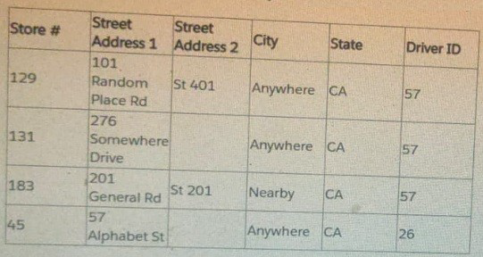
What does the client need to do to plot exact street addresses on the map?
A. Custom geocode the street addresses.
B. Change the data type of Street Address 1 and Street Address 2 to the Geographic role.
C. Establish a hierarchy of State > City > Street Address 1 > Street Address 2.
D. Add a Map layer to the visualization.
Explanation:
Tableau's built-in geocoding can automatically recognize standard geographical fields like State and City. However, it does not natively geocode exact street addresses (like "101 Random Place Rd" or "57 Alphabet St") to specific latitude and longitude coordinates, which are necessary for precise plotting.
Custom Geocoding: The consultant must use an external service or tool (like a geocoding API or a custom script) to translate the combination of Street Address 1, Street Address 2, City, and State into unique Latitude and Longitude values.
The resulting Latitude and Longitude fields would then be brought into the Tableau data source and assigned the Geographic Role (Latitude/Longitude), allowing the consultant to plot the exact store locations on the map.
Why Other Options Are Incorrect:
B. Change the data type of Street Address 1 and Street Address 2 to the Geographic role.
Incorrect. Assigning a geographic role to a string field like Street Address 1 only tells Tableau that the data represents a geographic location. It does not perform the translation (geocoding) of the street address text into usable latitude/longitude coordinates, which is the missing piece of data.
C. Establish a hierarchy of State > City > Street Address 1 > Street Address 2.
Incorrect. Creating a hierarchy helps with drilling down into the data, but it does not add the necessary latitude and longitude coordinates required for mapping the exact street addresses.
D. Add a Map layer to the visualization.
Incorrect. Adding a map layer (e.g., in recent Tableau versions) allows you to overlay different sets of marks (like stores and driver routes), but it does not solve the fundamental problem of the data lacking the coordinates needed to locate the Street Address on any map layer.
📚 References
Tableau Help: Custom Geocoding
Tableau's documentation guides users to custom geocode when they have location data (like street addresses or custom territories) that is not automatically recognized by the default map server, necessitating external data preparation to obtain latitude and longitude coordinates.
A consultant is designing a dashboard that will be consumed on desktops, tablets, and phones. The consultant needs to implement a dashboard design that
provides the best user experience across all the platforms.
Which approach should the consultant take to achieve these results?
A. Build one dashboard that has desktop, tablet, and phone layouts, and fix the size of the layouts.
B. Build one dashboard and fix the size of the dashboard.
C. Build one dashboard and set the size to Automatic.
D. Build one dashboard for each type of device and fix the size of the layouts.
Explanation:
Fixed-Sized Layouts within a Single Dashboard: This is the correct and most efficient method. Tableau allows a single dashboard to have different layouts optimized for various devices. When you design a dashboard, you can select 'Device Preview' and then add specific layouts for 'Desktop', 'Tablet', and 'Phone'. This means you only have one workbook to maintain on the server, but each device type gets a custom-tailored view. The fixed size ensures that the layout will appear as designed, without the elements shifting or resizing in a way that could break the user experience.
Why other options are incorrect:
B. Build one dashboard and fix the size of the dashboard: Fixing the size of a single dashboard to, for example, a desktop resolution, will lead to a poor experience on smaller devices like phones. The user would have to zoom and pan to see the content, making it difficult to interact with.
C. Build one dashboard and set the size to Automatic: Setting the size to Automatic tells Tableau to automatically resize the dashboard to fit the screen. While this might seem convenient, it can lead to unpredictable results. Charts may become too small to be readable, text can overlap, and the overall design can break on different screen sizes, especially on phones and tablets.
D. Build one dashboard for each type of device and fix the size of the layouts: This is inefficient. While it could technically work, it creates three separate workbooks (one for each device) that would need to be published and maintained. Any changes to the underlying data or calculations would have to be applied and tested on all three dashboards, which is a major time drain and a source of potential errors. The single-dashboard, multiple-layout approach is the best practice for streamlined development and maintenance.
A client wants to flag orders that have sales higher than the regional average.
Which calculated field will produce the required result?
A.
[Sales]
>
{ FIXED [Order ID] : SUM([Sales]) }
B.
{ FIXED [Order ID] : SUM([Sales]) }
>
{ FIXED [Region] : SUM([Sales]) }
C.
{ FIXED [Order ID] : SUM([Sales]) }
>
{ FIXED [Region] : AVG({ FIXED [Order ID] : SUM([Sales]) }) }
D.
{ FIXED [Order ID] : SUM([Sales]) }
>
{ INCLUDE [Region] : AVG({ FIXED [Order ID] : SUM([Sales]) }) }
Explanation:
{ FIXED [Order ID] : SUM([Sales]) } computes total sales per order (independent of the view).
{ FIXED [Region] : AVG( { FIXED [Order ID] : SUM([Sales]) } ) } computes, for each region, the average of those per-order totals.
Comparing them flags orders whose total is greater than the regional average order total—exactly what’s required.
Why others aren’t:
A. Compares row-level [Sales] to per-order totals (mismatch in granularity).
B. Compares per-order total to regional total sales, not the average per order.
D. Uses INCLUDE [Region] (view-dependent) and still averages the same inner value—doesn’t correctly fix the level like C does.
References:
FIXED LODs compute values at specified dimensions, independent of the view.
Overview of aggregation with LODs (how LODs reconcile with the view).
A client's fiscal calendar runs from February 1 through January 31.
How should the consultant configure Tableau to use the client's fiscal calendar when
building date charts?
A. Right click on the Date axis in charts and select Use Fiscal Calendar.
B. Edit the data source and set the Fiscal Year in the data preview window.
C. Create Calculated Fields using the FISCALQUARTER() and FISCALYEAR() functions.
D. Edit the data source Date Properties, then update the Default Properties of the Date Fields.
Explanation
To configure Tableau to use a non-standard fiscal year (such as a fiscal year starting on February 1), the correct method is:
✔ Set the Fiscal Year Start at the Data Source level
This is done by:
Going to Data Source.
Right-clicking the Date field → Default Properties → Date Format / Fiscal Year Start.
Setting Fiscal Year Starts: February.
OR
Right-click the data source and choose Date Properties, then specify the fiscal year start in the dialog.
This ensures that all sheets in the workbook use the client's fiscal calendar by default, and fiscal year-based date parts (FY, FQ, etc.) behave as expected.
❌ Why the other options are incorrect
A. Use Fiscal Calendar on the chart axis
This option does not exist.
You cannot set fiscal calendars per axis.
B. Edit the data source in the preview window to set Fiscal Year
The data grid preview does not provide a fiscal-year configuration option.
Tableau handles fiscal settings through Date Properties, not the preview grid.
C. Create calculated fields with FISCALQUARTER() / FISCALYEAR()
Tableau does not provide built-in functions named FISCALQUARTER() or FISCALYEAR().
You should not manually build fiscal date logic unless absolutely required.
Tableau already supports fiscal calendars natively.
⭐ Final Answer
D. Edit the data source Date Properties, then update the Default Properties of the Date Fields.
A client has many published data sources in Tableau Server. The data sources use the same databases and tables. The client notices different departments
give different answers to the same business questions, and the departments cannot trust the data. The client wants to know what causes data sources to return
different data.
Which tool should the client use to identify this issue?
A. Tableau Prep Conductor
B. Ask Data
C. Tableau Catalog
D. Tableau Resource Monitoring Tool
Explanation:
Why it’s correct:
Tableau Catalog (part of the Data Management add-on) lets you see end-to-end data lineage, impact analysis, external assets (databases, tables, fields), data quality warnings, and metadata. That visibility is exactly what you need to diagnose why multiple published data sources—pointing at the same underlying tables—are producing different answers (e.g., different joins, filters, extracts vs. live, field definitions).
Why the others aren’t:
A. Tableau Prep Conductor: Schedules/monitors Prep flows; it doesn’t provide cross-source lineage/impact analysis.
B. Ask Data: Natural-language querying of a data source; it doesn’t explain discrepancies between data sources.
D. Resource Monitoring Tool: Monitors server performance/health, not data lineage or source differences.
Use the following login credentials to sign in
to the virtual machine:
Username: Admin
Password:
The following information is for technical
support purposes only:
Lab Instance: 40201223
To access Tableau Help, you can open the
Help.pdf file on the desktop.
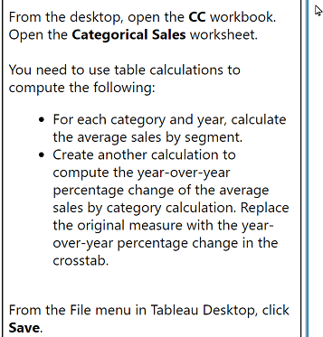
From the desktop, open the CC workbook.
Open the Categorical Sales worksheet.
You need to use table calculations to
compute the following:
For each category and year, calculate
the average sales by segment.
Create another calculation to
compute the year-over-year
percentage change of the average
sales by category calculation. Replace
the original measure with the yearover-
year percentage change in the
crosstab.
From the File menu in Tableau Desktop, click
Save.
Explanation:
1. Open the workbook
Launch Tableau Desktop on the VM.
Open the file named CC.twb(x) on the desktop.
Open the worksheet Categorical Sales.
Part 1 — Compute Average Sales by Segment (per Category and Year)
Step 1: Build the basic view
Drag Category to Rows.
Drag Year(Order Date) (discrete, blue YEAR) to Rows to the right of Category.
Drag Segment to Columns.
Drag Sales to Text (Marks card).
This creates a crosstab of Sales by Category → Year → Segment.
Step 2: Convert Sales to Average Sales
You need a table calculation to compute average sales by segment per category and year.
Right-click the SUM(Sales) pill.
Select Quick Table Calculation → Average
(or manually create a calculated field if instructions require).
Important: If the instructions expect an explicit calculation instead of the quick table calc:
Create a new field:
WINDOW_AVG( SUM([Sales]) )
Then set Compute Using → Segment or Table Across depending on layout.
The value should now show average sales per segment for each Category + Year.
Part 2 — Compute YoY % Change of the Average Sales
Now you must compute year-over-year % change of that average sales table calculation.
Step 1: Create the YoY Calculation
Create a new calculated field:
Calculation: YoY % Change
Then set Compute Using → Segment or Table Across depending on layout.
The value should now show average sales per segment for each Category + Year.
Step 2: Create the YoY Calculation
Create a new calculated field:
Calculation: YoY % Change
(SUM([Sales]) - LOOKUP(SUM([Sales]), -1))
/
LOOKUP(SUM([Sales]), -1)
If you used WINDOW_AVG before, the YoY calc becomes:
(WINDOW_AVG(SUM([Sales])) - LOOKUP(WINDOW_AVG(SUM([Sales])), -1))
/
LOOKUP(WINDOW_AVG(SUM([Sales])), -1)
Step 2: Add the calculation to the view
Drag the new YoY % Change field onto Text (replace the existing value).
Right-click the field → Edit Table Calculation.
Step 3: Set Compute Using
Set Compute Using → Table Down (or Year) so the calculation compares each row’s year with the previous year.
You should now see YoY % change values for each Category × Segment.
3. Replace the Original Measure
The instructions say:
“Replace the original measure with the year-over-year percentage change in the crosstab.”
You have already done this by replacing the Text field with YoY % Change.
4. Save the Workbook
Go to File → Save.
You’re done.
Final Answer (Short Form)
Use a table calculation for average sales (WINDOW_AVG), then create a second table calculation using LOOKUP() to compute year-over-year % change, set the table calculation direction to Table Down, place it on the crosstab, and save the workbook.
A company has a data source for sales transactions. The data source has the following characteristics:
. Millions of transactions occur weekly.
. The transactions are added nightly.
. Incorrect transactions are revised every week on Saturday.
· The end users need to see up-to-date data daily.
A consultant needs to publish a data source in Tableau Server to ensure that all the transactions in the data source are available.
What should the consultant do to create and publish the data?
A. Publish an incremental extract refresh every day and perform a full extract refresh every Saturday.
B. Publish a live connection to Tableau Server.
C. Publish an incremental refresh every Saturday.
D. Publish an incremental extract refresh every day and publish a secondary data set containing data revisions.
Explanation:
This scenario involves a high-volume transactional data source with:
Daily additions (new transactions added nightly)
Weekly corrections (incorrect transactions revised every Saturday)
Daily reporting needs (users need fresh data every day)
To balance performance and data accuracy, the best practice is:
Incremental extract refresh daily: Efficiently adds new data without reloading the entire dataset.
Full extract refresh weekly (Saturday): Ensures that corrected transactions are reflected in the data.
This approach minimizes server load while ensuring data integrity and freshness.
❌ Why the other options fall short:
B. Live connection: Not ideal for millions of rows; can cause performance issues and strain the database.
C. Incremental refresh every Saturday: Misses daily updates; users won’t see new transactions until Saturday.
D. Incremental refresh + secondary dataset: Overcomplicates the architecture and introduces maintenance challenges. A full refresh is simpler and more reliable for handling corrections.
🔗 Reference:
Tableau Extract Refresh Strategies
Best Practices for Publishing Data Sources
A client wants to provide sales users with the ability to perform the following tasks:
· Access published visualizations and published data sources outside the company network.
· Edit existing visualizations.
· Create new visualizations based on published data sources.
. Minimize licensing costs.
Which site role should the client assign to the sales users?
A. Explorer (can publish)
B. Site Administrator
C. Viewer
D. Creator
Explanation:
Correct Solution: Explorer (can publish) (Option A)
The Explorer (can publish) site role is the perfect fit because it grants sales users exactly what they need while minimizing licensing costs:
Access published visualizations from anywhere (including outside the network) – Yes
Edit existing visualizations – Yes (they can open workbooks and save overwrites or new versions to the server)
Create new visualizations based on published data sources – Yes (they can connect to any published data source and publish new workbooks)
Lowest possible license cost for these capabilities – Yes (significantly cheaper than Creator licenses)
This role is designed precisely for power business users who need full interactivity and publishing rights without the overhead (and cost) of a full Creator license.
Why Site Administrator (Option B) Is Overkill and Expensive
Site Administrator gives complete control over the entire Tableau site (user management, projects, settings, etc.). It is unnecessary, risky from a governance standpoint, and still consumes a Creator-level license.
Why Viewer (Option C) Is Insufficient
Viewer is read-only. Users can view dashboards and interact with filters/actions, but they cannot edit or create new content and cannot publish anything — failing two of the four requirements.
Why Creator (Option D) Is Unnecessarily Expensive
Creator provides everything (including Desktop access, ability to build from live connections or new extracts, etc.), but it is the most expensive license tier. Since the sales users only need to work with published data sources and published visualizations, Explorer (can publish) delivers the same end-user experience at a lower cost.
In summary, when the goal is to enable editing, creating, and publishing from published content outside the network while minimizing licensing costs, the Analytics-Con-301 answer is always A – Explorer (can publish). This is Tableau’s official cost-optimization recommendation for this exact scenario.
| Page 1 out of 10 Pages |
| 123 |
Our new timed 2026 Salesforce-Tableau-Consultant practice test mirrors the exact format, number of questions, and time limit of the official exam.
The #1 challenge isn't just knowing the material; it's managing the clock. Our new simulation builds your speed and stamina.
You've studied the concepts. You've learned the material. But are you truly prepared for the pressure of the real Salesforce Certified Tableau Consultant exam?
We've launched a brand-new, timed Salesforce-Tableau-Consultant practice exam that perfectly mirrors the official exam:
✅ Same Number of Questions
✅ Same Time Limit
✅ Same Exam Feel
✅ Unique Exam Every Time
This isn't just another Salesforce-Tableau-Consultant practice questions bank. It's your ultimate preparation engine.
Enroll now and gain the unbeatable advantage of:
Copyright © - All Rights Reserved